Well I have had this for a few weeks now and thought I'd give you my impressions.
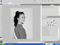
I really don't like the tabbed images layout (and it seems I'm not alone) it wouldn't be so bad if you could turn them off, but although there is an option to turn it off it still tabs the first image, so it's not really off is it Adobe!
I also dislike the new pallet system, if they stayed where you put them it would be great, but sadly if you click on one it minimises the others, not ideal, please Adobe bring back the old pallets, or give us the option of locking these open.
While I'm in critic mode, it's heavy on RAM, it really needs a compatible video card for the GPU acceleration to work. Some people don't like the lighter grey background (although you can change that) And for the life on me I can't understand why the took out the extract filter, pattern maker etc etc.
Looking on the plus side, the new version of ACR (camera raw) has some great new features, more in line with Lightroom, although there is one curious anomaly that most people will never find, and it's jolly usefull. No I'm not going to tell you, find it yourself, I'll give you a clue though, look at the preview options in the different tabs, most only show the changes on that tab, one however will show you all the changes.
The content aware scalling is a very clever tool, but it does need a certain type on image to work well, and if your a clever so and so you could get the same effect with a bit of free transform.
Overall impressions, is it worth the upgrade from CS3? personally I'd say no. Wayne

No comments:
Post a Comment